Digital design director
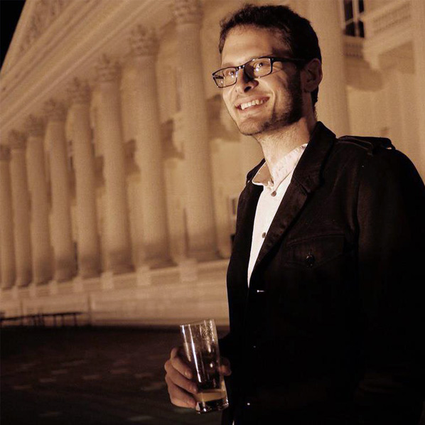
Benjamin Rancic
Solving real-world problems through digital design
Selected projects
I've helped clients of all sizes help succeed over the years. I led comprehensive digital projects, built online stores, designed talent portals, directed social campaigns, created video and crafted brochures. A few hand-picked examples below.

A personal approach
Lead | UX | AD | Video
Personalisation – on a massive scale
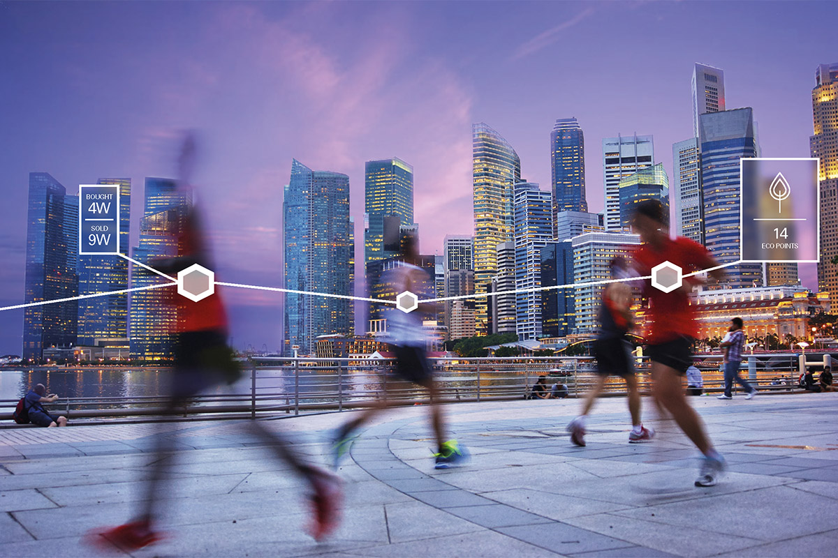
Sales is all about conversations and a personal connection. But of course, at a certain scale, it becomes impossible to keep a genuine person-to-person dialogue with a vast network of potential leads. Which is where the Account Based Marketing (ABM) services of the agency I was working with at the time really came into their own. We enabled each of the client’s key accounts to feel they received a completely bespoke offering, tailored to their exact needs at the time.
Leading a diverse digital team
We achieved this mass personalisation with a robust in-house digital team that I led. We achieved remarkable results (albeit confidential), using the full might of the client’s own awesome digital capabilities while working with a global network of our and client teams.

Interactive and video
The output was as varied as the clients – we built plenty of websites, as well as campaign microsites, ran targeted PPC campaigns including retargeting and ran comprehensive email campaigns. While the volume and diversity was huge, what I prioritised throughout was a commitment to technical and ethical best practices and above all putting the user first.



Soaring talent
Lead | UX | UI | AD
Helping an airline take off
‘Generation easyJet’ - It's more than just a slogan; it's a state of mind. It defines the attitude of the people who forge their own paths, and enjoy every single minute of it. So it felt only natural to bring this to life when they asked us at SMRS to create their new careers site.
As the project lead, my overall aim was to create a site that will attract exceptional high-flyers to consider the airline as an employer of choice. Not just the obvious pilots and flight staff everyone would expect, but to help grow their engineering, business, IT and other teams.

Developing personas
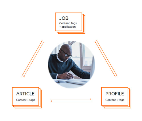
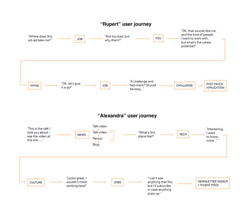
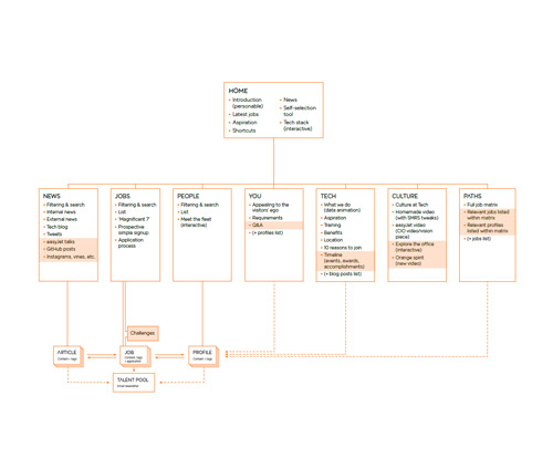
The point of departure was to thoroughly understand the visitors; the future candidates. After extensive research we built the personas, their user journeys and a sitemap around those. I was quite set on a phased development to allow for ongoing testing and an organic iteration of content.
Creating a design system
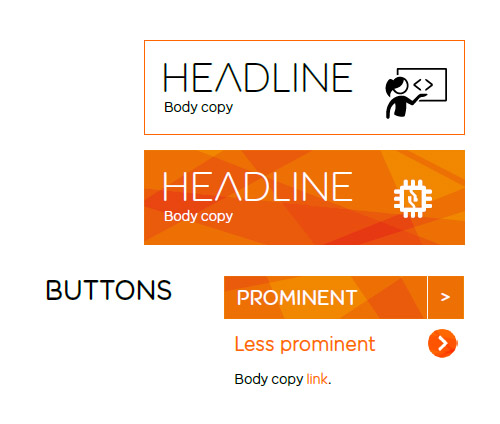
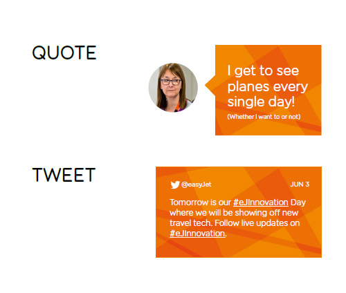
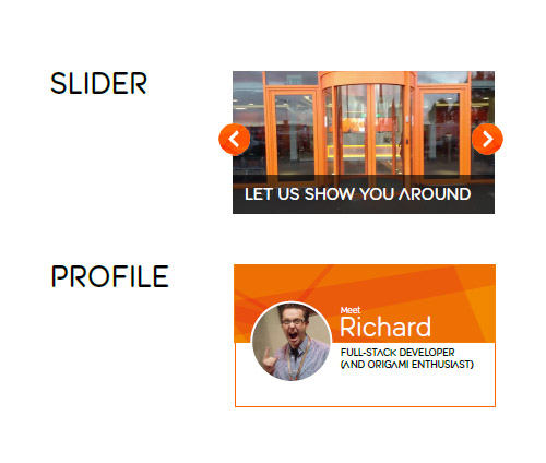
To prevent things spinning out of control as the site inevitably grew further down the line, I put in place a robust design system. This guided both our design work and set an easy-to-follow roadmap for later developments. It included all the building blocks of the site and through its evolution also influenced and expanded the employer brand itself.
Pushing the boundaries of tech
I wanted the site to have something a little bit different from a technology standpoint – to push the brand, and our development team. So in place of an intro video, I instead built a fully responsive HTML5 animation to tell the story of the brand and its achievements to visitors unfamiliar with their successes (saved as a plain YouTube copy below).
Crafting designs
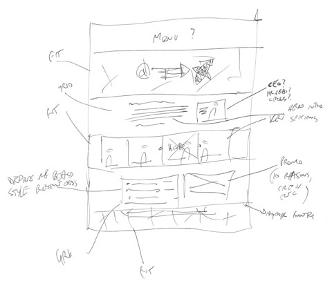
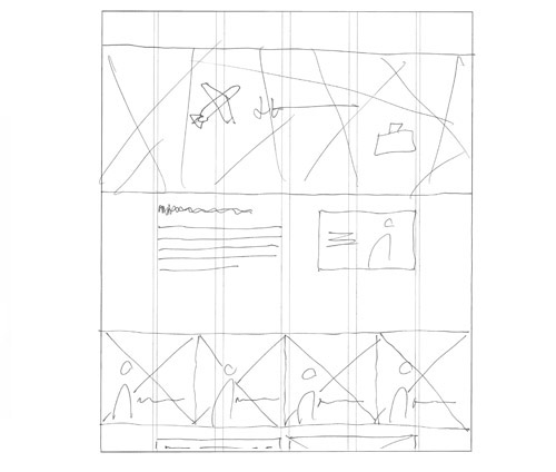
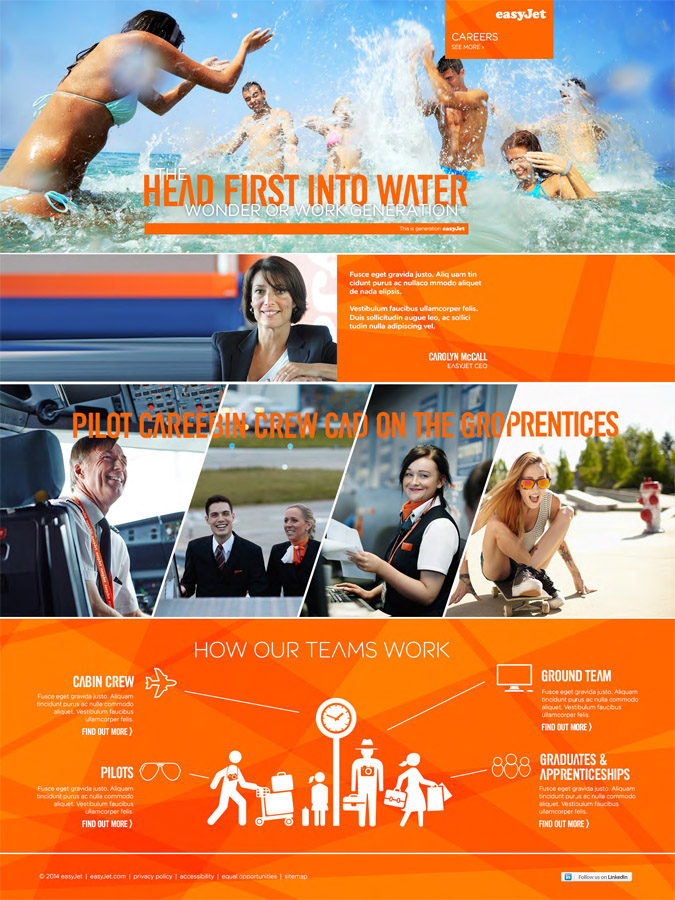
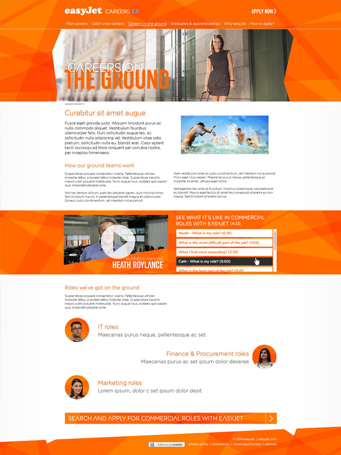
Bringing it all together, we created a comprehensive site that delivered results for the client, spoke to the visitors, and looked excellent across all conceivable devices. The development went through a number of stages (shown below), each gaining detail and functionality with each round.
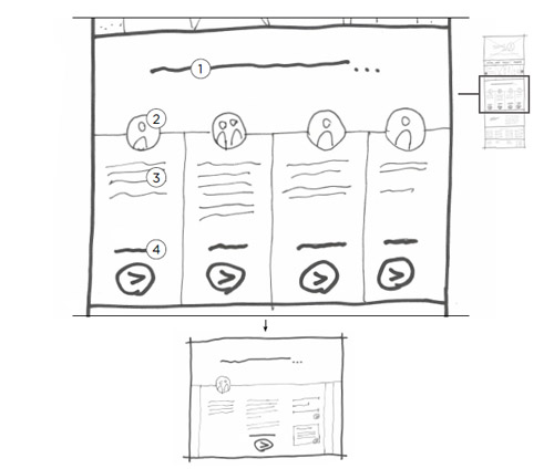
The final designs featured bespoke workplace photography, lush lifestyle imagery and the brand signature graphics.
Ever upwards
And the site has been flying steady ever since. It received laudations at industry award ceremonies, it attracted two million new visitors, the visit duration has gone up by 25% and bounce rates have been reduced up to 45%.


Exciting the brightest
ACD | AD | Video
Long-lasting relationship
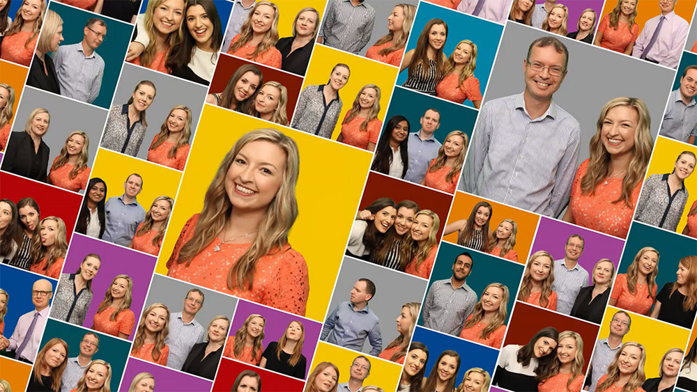
We were involved with KPMG over a few years, with a clear long-term goal – reshaping how graduates saw them as a potential employer. And through them, the consulting sector. They were very good at recruiting a certain calibre of candidate, but wanted to expand their reach and further improve and excel at recruiting the best and the brightest.
Extensive research and reach
We performed an incredible amount of research with the target audiences to extract what really mattered to them and how to best approach them. Through our findings, we completely changed the way the employer brand positioned itself, and fine-tuned the results with each consecutive campaign.
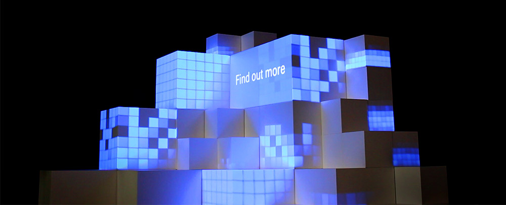
Delivering on all cylinders
We delivered comprehensive omnichannel work, which included everything from physical installations featuring interactive projection-mapped animations, a range of videos, online interactive features as well as elaborate paper-engineered brochures and all forms of outdoor advertising imaginable.
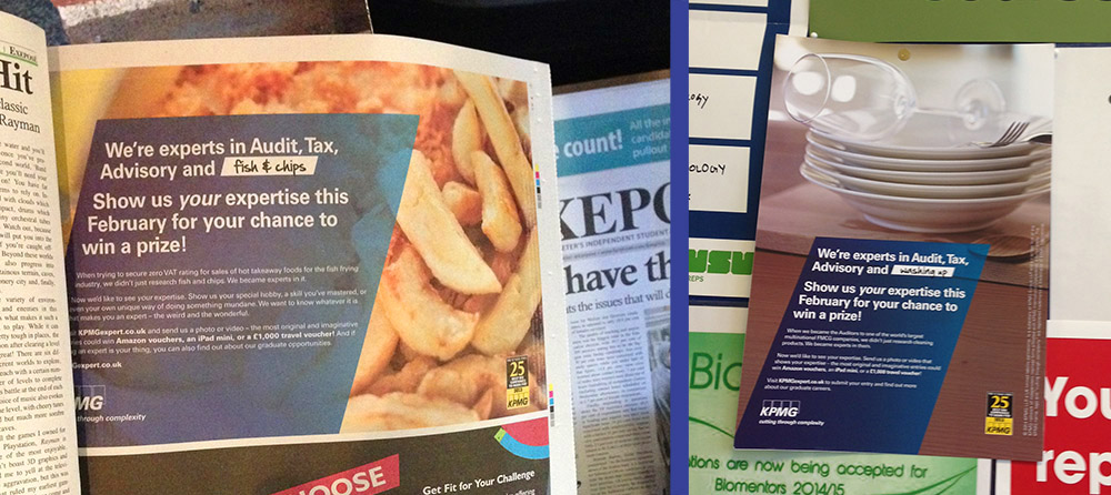
Impressive results
And the results spoke for themselves – once our work was fully delivered, the client reported their best-ever results, with targets exceeded by almost half.
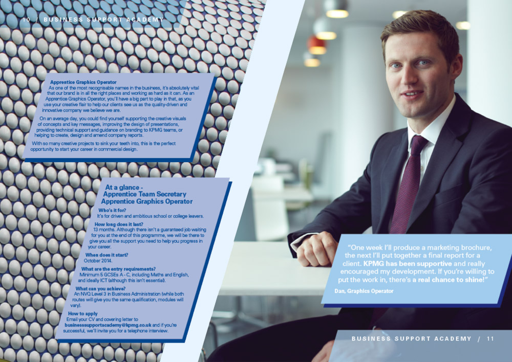
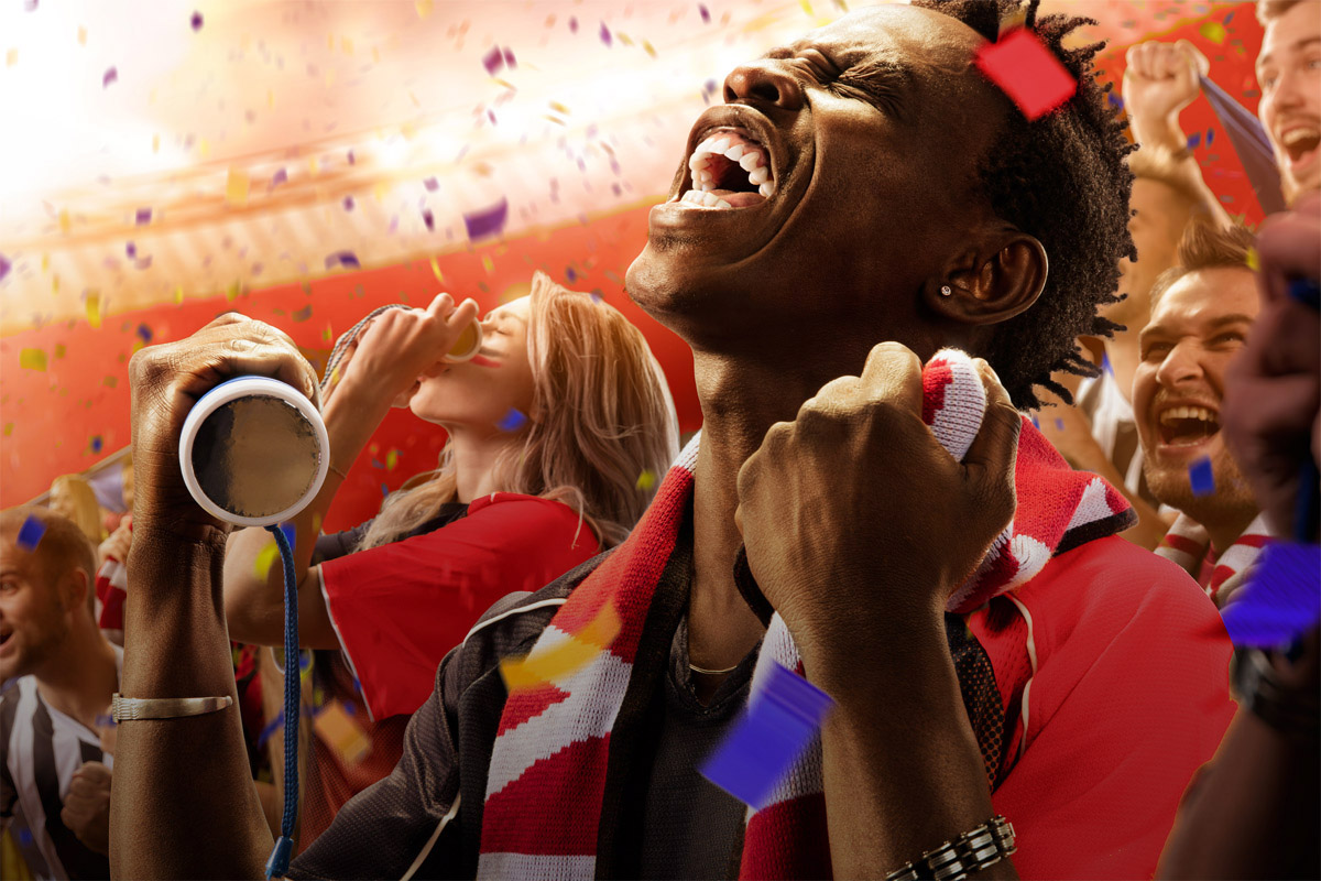

A sprinkling of fun
Lead | Concept | UX | UI
Work & play
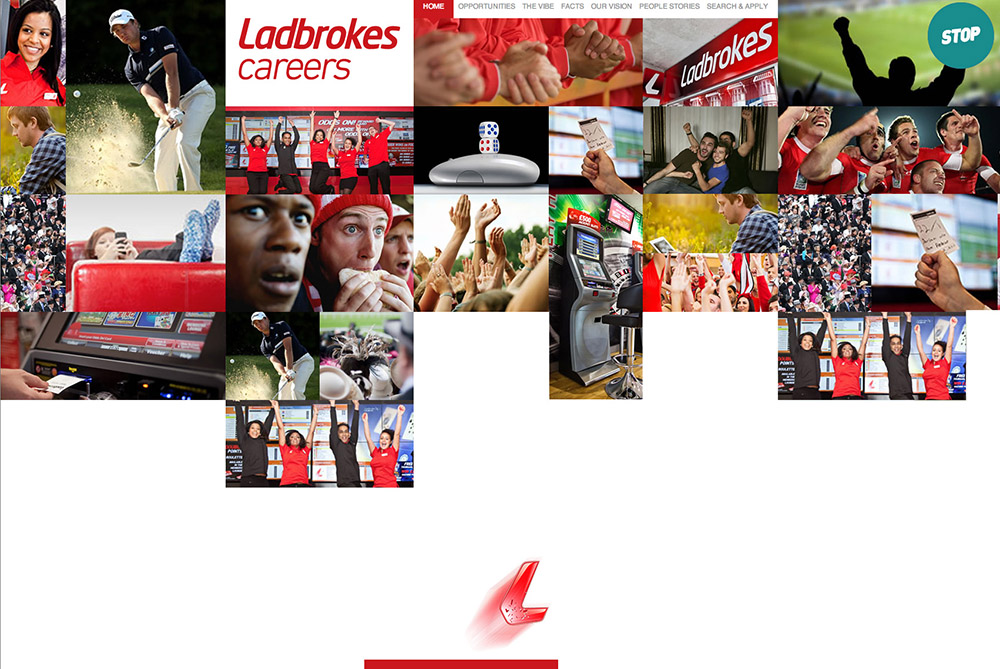
While I was at SMRS, we were asked to refresh the careers website for Ladbrokes, a nationwide high street betting shop. They had one already, but it wasn't quite right – it wasn't fun. With a few key improvements, we quickly changed all that.
Adding sparkle
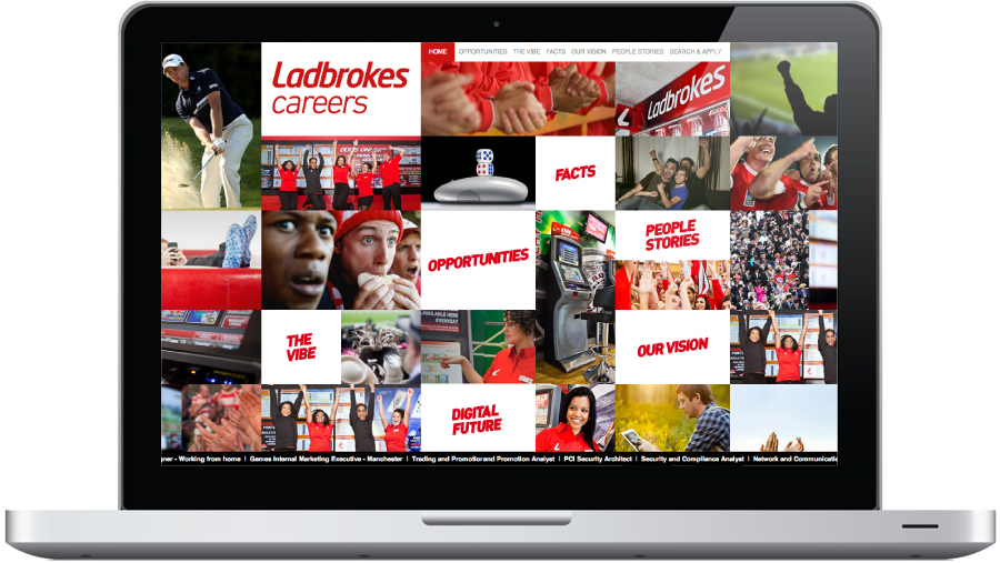
The first set of improvements was pixel-deep - I jazzed up the visuals, dialled them up to 11, and brought them in line with the exciting and playful spirit of the brand. So now an animated photo mosaic greets visitors to the website, generous helpings of confetti visuals were thrown in and a ticker tape showing current jobs was set up to echo their on in-store screens.
A whole new set of fireworks
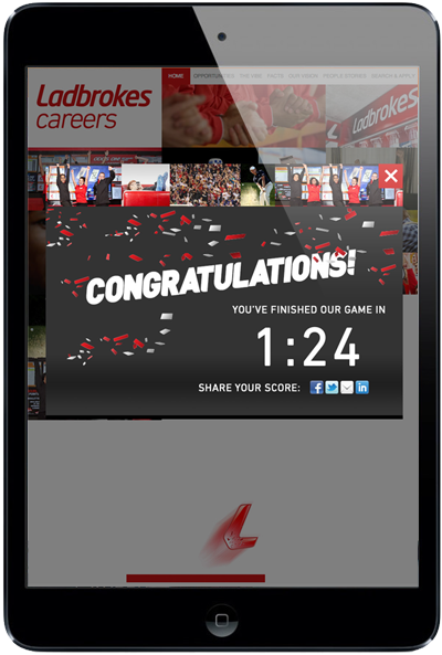
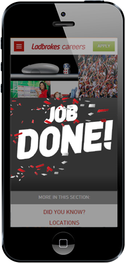
The second set of improvements was considerably deeper - I wanted to bring the excitement of playing games into the website itself. Our proposal was a set of playful interactive Easter eggs dotted throughout the website to gamify the job-hunting experience. So the intro photo mosaic would transform into a playable Breakout-like game, the list of jobs would be presented as a playable slot machine, and there would be a host of other playable challenges throughout the website.
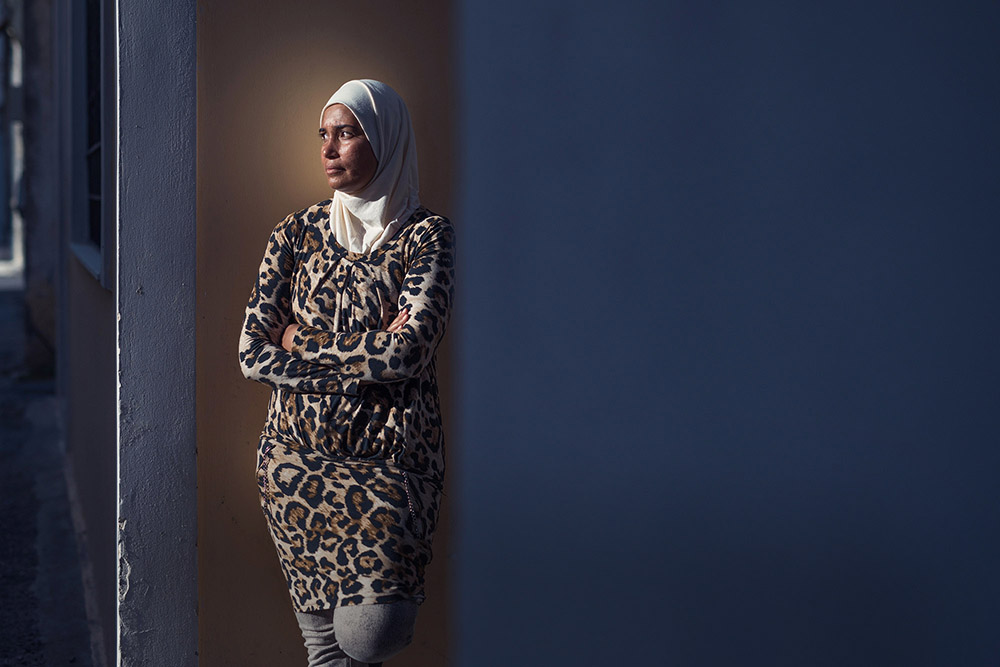

Revealing Heroes
Personal | UX | UI
Ode to humanity
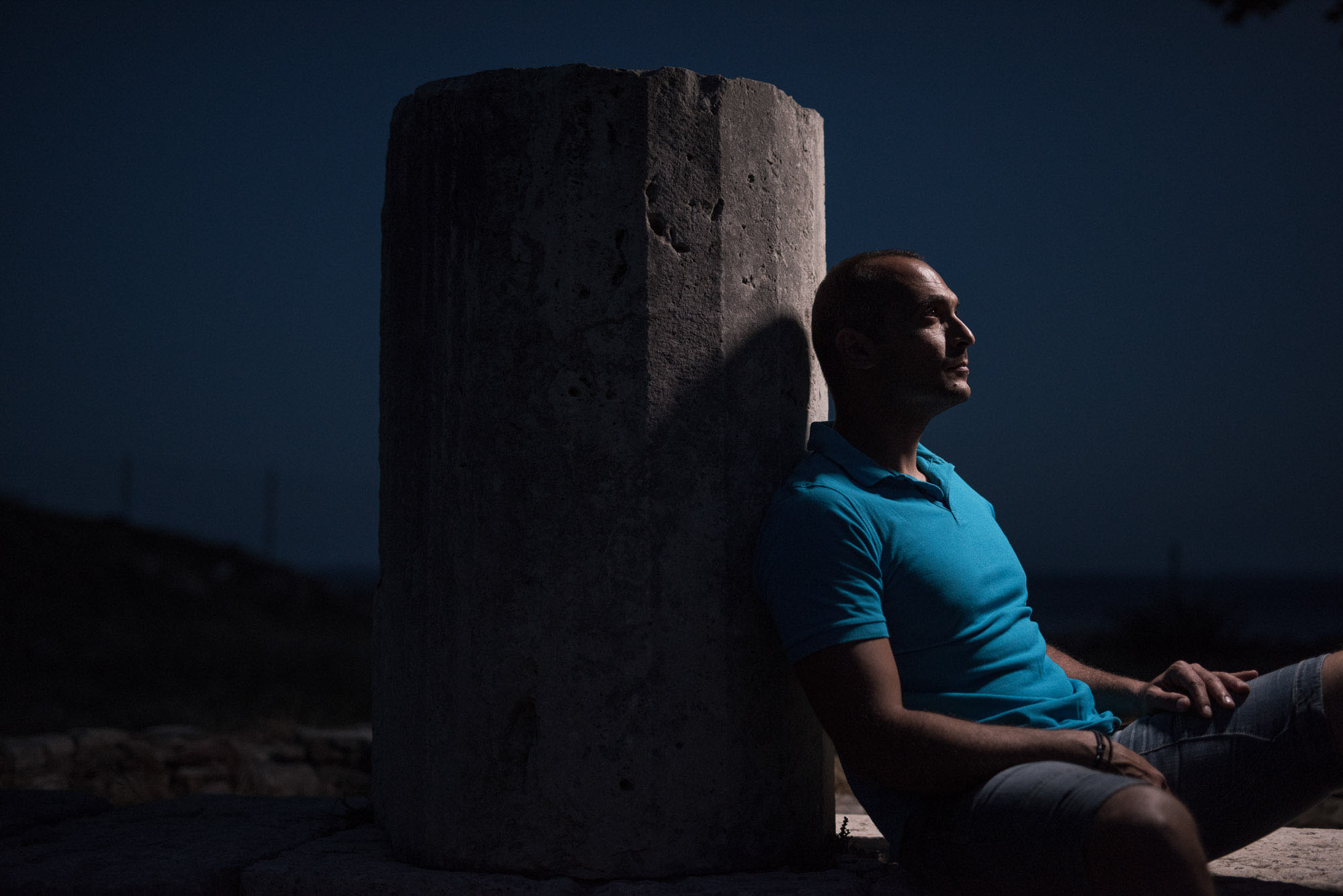
When the photographer behind the Heroes initiative approached me about this project, I was really keen to get involved. I thought it would be great if my work helped raise awareness and offer support to the people involved. And I occasionally do personal projects, which tend to complement my day-to-day agency work, it seemed like a great way to balance things out.
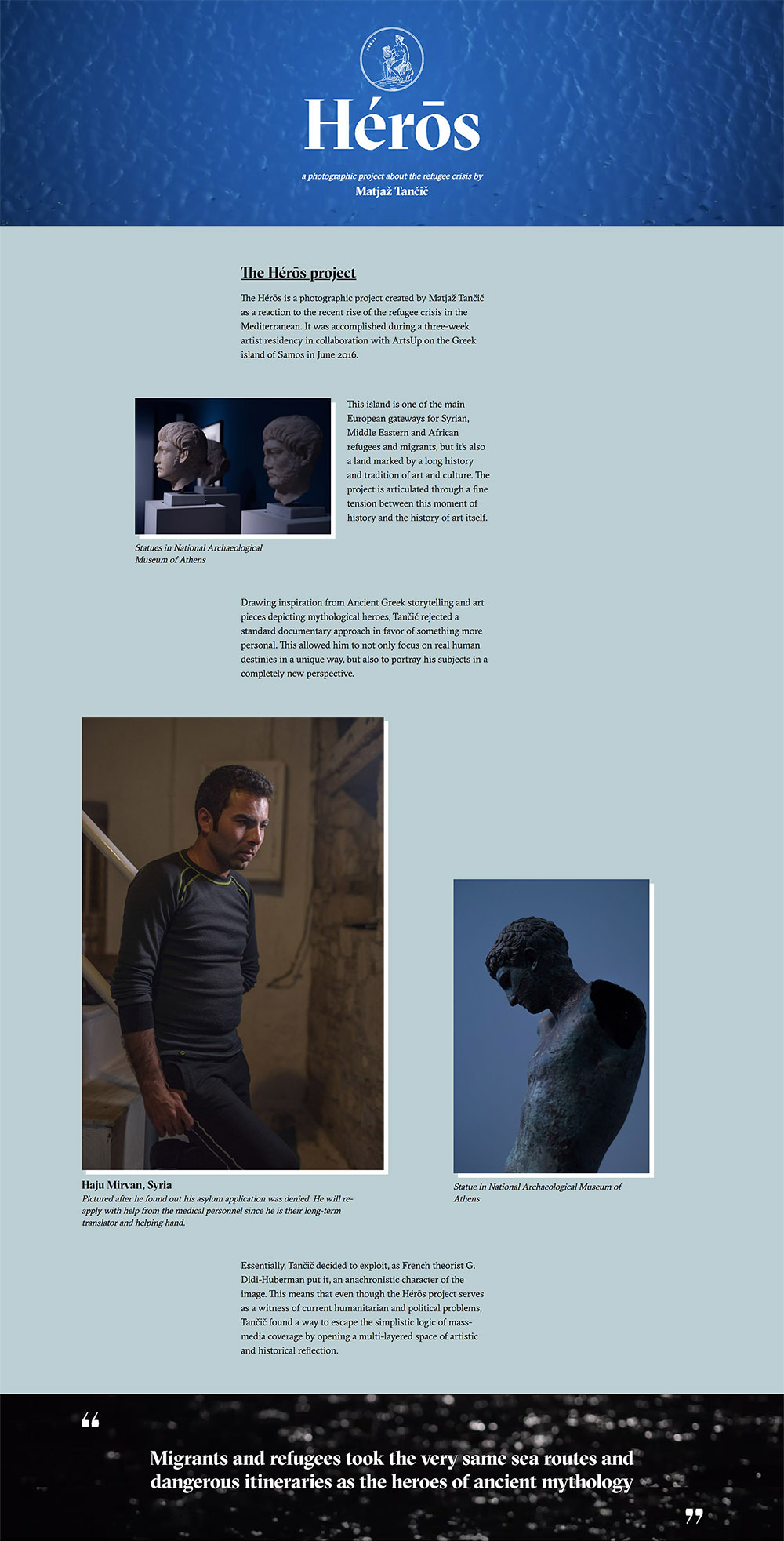
Elevating storytelling
What intrigued me most about this challenge was how to best use the digital space and tools to tell the story better – but without getting in the way. It’s a pressing contemporary topic with people literally the heroes, so search was on how to offer them the best pedestal possible.
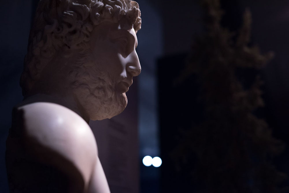
Technical flawlessness
It being a personal project where I was essentially given free reign, I wanted to focus on honing the technical craft with design exploration – creating unique responsive layouts, exploring unusual design combinations and mixing diverse content formats.
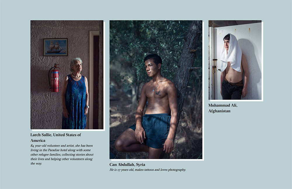
Compelling results
In the end what we created with the wider team was a lovely microsite that hopefully told the story of contemporary people inadvertently retracing the steps of heroes or ancient times.

A glimpse of greatness
Lead | Concept | Video | UI
Doing cool sh*t
This is a personal project I just really wanted to do – purely because it seemed like a fun thing to get involved with. Who wouldn’t want to channel their inner Raging Bull and jump into a boxing ring with a couple of boxers, armed only with a camera? Or spend a couple of days filming in a pole dancing studio?
A boxing champion and a leading dance instructor
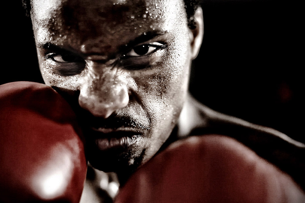
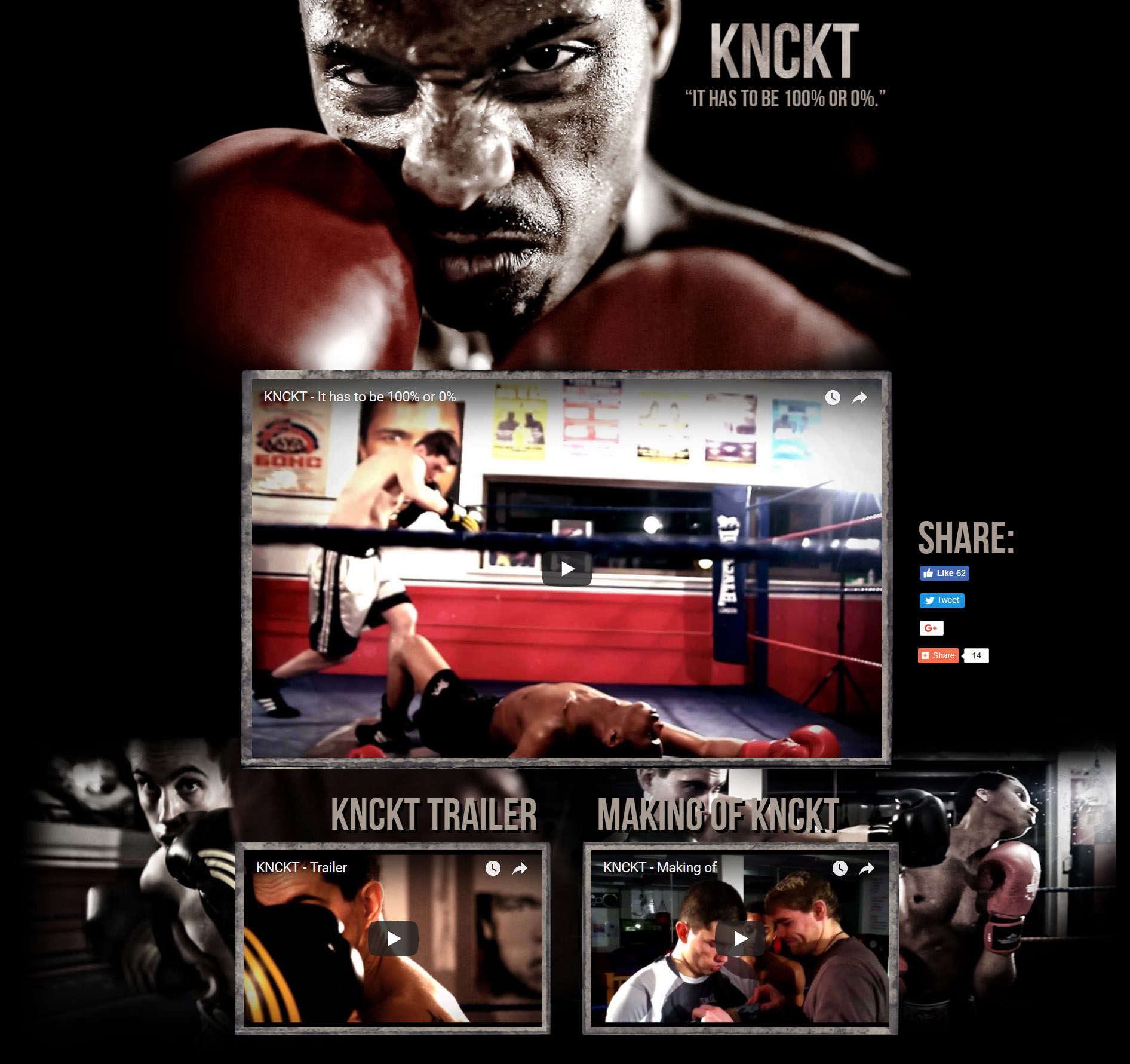
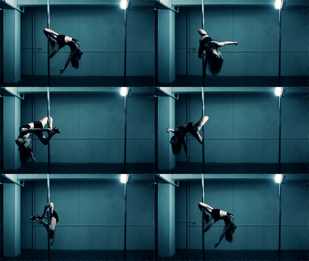
Both KNCKT (pronounced Knockout) and Bugsy (named after the dancer, Bugsy Monroe) were intended as vignettes of two unique London sportspeople – both excelling in their fields and committed to practicing their chosen sports. I really wanted to portray them in a beautiful, cinematic way, and tell a bit of their stories. Essentially, to catch a glimpse of their greatness.
As I knew both protagonists, I was the producer of the videos, and after filming was done did the video editing to a bespoke soundtrack by a MTV EMA-awarded producer, as I creating the supporting microsites.
KNCKT
See also the KNCKT microsite & making of:
Bugsy
See also the Bugsy microsite & making of:
While we were at it, I also prepared a few cinemagraphs, one of which below:
Other clients include


































... and there's always room for more ;)
I aim for better.
I believe there's always a better way to solve a problem. That a better design can be created. And there’s a better way to tell a story. (And there's also probably a better way to write a personal summary.)
I try to find these better ways. Challenge the status quo to find excellence. And then explore to see what's better still.
Because digital experiences can be more engaging, more influential and more successful when they are crafted with passion;
because telling stories in the right way can make us understand, internalise and genuinely care about issues we didn't even know existed;
because businesses excel when they are understood and have better tools to work with;
and because teams can flourish, achieve more and create better work when they have the right steer — and then get better still.
The same held true when I spoke at events, contributed to magazines, exhibited at the Expo World Fair, Milan Furniture Fair and Venice Architectural Biennale or held solo shows at museums — there's always a better way to do it, and it's usually only the deadline that stops the chase.
You could say I'm a betterer. But I prefer to go by digital design problem-solver, as my work lays in solving the issues that arise in the intersection of design, technology and business.
Let's make things better together.

